Temporal Data Analytics
The project aims at developing solutions for analyzing temporal data. Temporal data in this context is not only referred to point timestamped data, for instance time series, but also interval timestamped data, i.e. series where the time measure is an interval.
This project is partially funded by the research grants VCTP - IN2059 and ISMarD - WW200N of Free University of the Bozen-Bolzano.
Demonstrations
VISOR
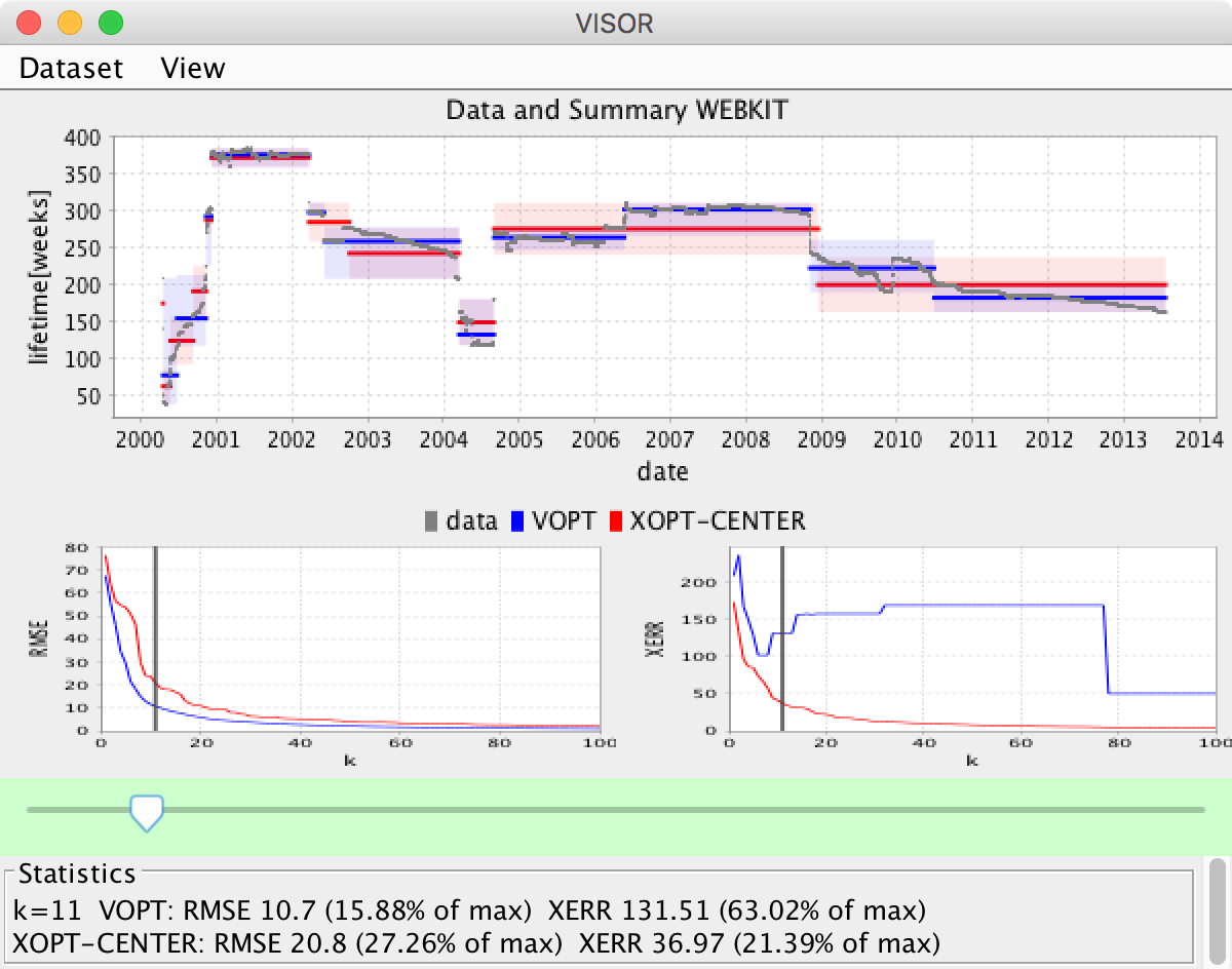 VISOR helps the user to explore data and their summary
structures by visualizing the relationships between the size
k of a data summary and the induced error. Given an ordered
dataset, VISOR allows to vary the size k of a data summary
and to immediately see the effect on the induced error, by
visualizing the error and its dependency on k in an
ε-graph and Δ-graph, respectively. The user can
easily explore different values of k and determine the best
value for the summary size. VISOR allows also to compare
different summarization methods, such as piecewise constant
approximation, piecewise aggregation approximation or
V-optimal histograms.
VISOR helps the user to explore data and their summary
structures by visualizing the relationships between the size
k of a data summary and the induced error. Given an ordered
dataset, VISOR allows to vary the size k of a data summary
and to immediately see the effect on the induced error, by
visualizing the error and its dependency on k in an
ε-graph and Δ-graph, respectively. The user can
easily explore different values of k and determine the best
value for the summary size. VISOR allows also to compare
different summarization methods, such as piecewise constant
approximation, piecewise aggregation approximation or
V-optimal histograms.
HotPeriods
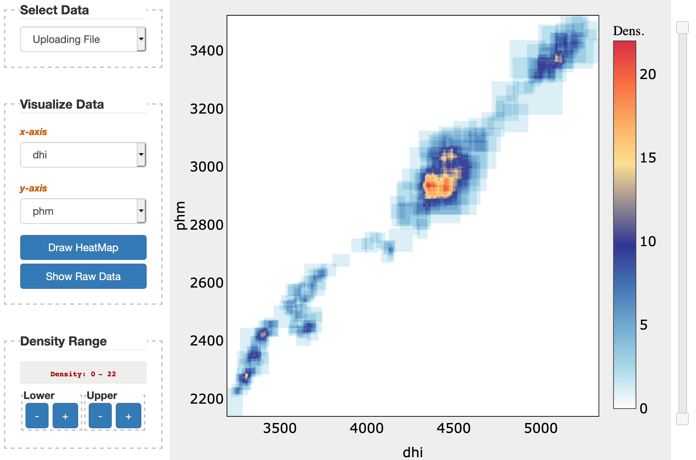 With the ever increasing amount and complexity of data,
visual analysis becomes a fundamental tool to spot
correlations and other relationships in data. Most techniques
(e.g., scatter plots or heatmaps) focus on point data, i.e.,
data with point measures, such as prices or volumes. We focus
instead on data with interval measures, that is data where
measures consist of an interval or range of values, such as
price ranges or time intervals. HOTPERIODS allows to
visualize correlations between two interval measures in the
two-dimensional space, where the two measures represent a
rectangle. To visualize such data, we first perform a
rectangle aggregation. The result of this aggregation is a
density matrix, where each cell stores the number of
rectangles that cover the corresponding points in space. For
the visualization of the density matrix, color-coding is used
to represent different density values similar to heatmaps.
With the ever increasing amount and complexity of data,
visual analysis becomes a fundamental tool to spot
correlations and other relationships in data. Most techniques
(e.g., scatter plots or heatmaps) focus on point data, i.e.,
data with point measures, such as prices or volumes. We focus
instead on data with interval measures, that is data where
measures consist of an interval or range of values, such as
price ranges or time intervals. HOTPERIODS allows to
visualize correlations between two interval measures in the
two-dimensional space, where the two measures represent a
rectangle. To visualize such data, we first perform a
rectangle aggregation. The result of this aggregation is a
density matrix, where each cell stores the number of
rectangles that cover the corresponding points in space. For
the visualization of the density matrix, color-coding is used
to represent different density values similar to heatmaps.
An online version of the prototype can be found at http://archimedes.inf.unibz.it:8080/hotperiods
Members
- Johann Gamper
- Anton Dignös
- Necati Duran
- Giovanni Mahlknecht
Publications
HOTPERIODS: Visual Correlation Analysis of Interval Data. SSTD 2019: 178-181.
VISOR: Visualizing Summaries of Ordered Data. SSDBM 2017: 40:1-40:5.
Faculty of Engineering
NOI Techpark - Bruno-Buozzi-Straße 1 - via Bruno Buozzi 1
39100, Bozen-Bolzano
Copyright © 2026 - Database Systems Group - Faculty of Engineering - Free University of Bozen-Bolzano